Nvidia’s earnings call reinforced its position as the world’s most valuable company, boasting a staggering $3.61 trillion market cap. While its cutting-edge technology and innovation continue to dominate the AI and computing sectors, NVIDIA isn’t without its challenges. Compared to Apple and Microsoft—its closest contenders for the top three largest companies by market capitalization—NVIDIA falls short in usability and user experience. Apple’s intuitive ecosystem and Microsoft’s enterprise-friendly solutions highlight the usability gap that NVIDIA must address to sustain its leadership on all fronts.
Key Takaways
- Glassmorphism, a UI design trend using frosted-glass aesthetics, enhances visual appeal and usability when implemented correctly.
- Apple and Microsoft excel in this trend, prioritizing readability, accessibility, and performance, while Nvidia’s website design falls short due to poor readability, excessive effects, and performance issues.
- Designers should prioritize accessibility, use glassmorphism sparingly, and optimize for performance to create effective and user-friendly interfaces.
Glassmorphism in UI Design: How Apple and Microsoft Get It Right—But Nvidia Misses the Mark
In the world of UI design, glassmorphism has emerged as a powerful trend. Its frosted-glass aesthetic brings depth and dimensionality to interfaces, creating a visually appealing and modern experience. Industry leaders like Apple and Microsoft have successfully implemented this trend in their design systems, enhancing both usability and brand identity. However, even a tech giant like Nvidia can stumble when it comes to applying fundamental design principles.
Here’s how glassmorphism works, what makes Apple and Microsoft shine, and where Nvidia’s implementation falls short.
What is Glassmorphism?
Glassmorphism is a UI design style characterized by semi-transparent, blurred elements that mimic the look of frosted glass. It creates a sense of depth by layering these translucent components over vibrant backgrounds.
Core Characteristics:
- Transparency: Adds lightness by allowing parts of the background to remain visible.
- Blurred Backdrops: Softens background elements to highlight the foreground.
- Layering: Mimics the effect of stacked glass panels, adding depth and hierarchy.
While visually striking, successful implementation requires attention to usability, readability, and performance.
Apple: A Masterclass in Glassmorphism
[/vc_column_text]
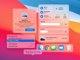
Apple popularized glassmorphism with the release of macOS Big Sur, embedding it into the operating system’s core interface. Apple’s application of the trend showcases its strengths:
- Usability First: Apple maintains excellent contrast between text and frosted backgrounds, ensuring readability for all users.
- Minimalist Elegance: Frosted panels are used sparingly, complementing Apple’s signature clean design aesthetic.
- Seamless Integration: Across macOS, iOS, and iPadOS, glassmorphism reinforces brand consistency, appearing in key areas like the Control Center and notification trays.
Apple’s thoughtful design approach ensures that the aesthetic enhances the user experience rather than detracting from it.
Microsoft: Contextual Brilliance with Glassmorphism
Microsoft has also embraced glassmorphism in its Fluent Design System, particularly through Windows 11’s Acrylic Material. Their approach highlights context and depth:
- Guiding User Focus: Frosted elements in the Start Menu and taskbar create a subtle focus effect, helping users navigate seamlessly.
- Dynamic Adaptability: The interface adjusts based on background colors, making it feel integrated and polished.
- Accessibility Considerations: High-contrast modes and clear visual hierarchy ensure the design is inclusive for all users.
Microsoft leverages glassmorphism to provide clarity and depth without compromising functionality.
Where Nvidia Misses the Mark
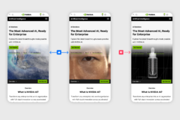
Nvidia’s website shows a glaring misstep in its use of glassmorphism. While the design aims for a futuristic, high-tech aesthetic, it violates fundamental design principles. Right off the bat you can tell it doesn’t reach the minimum color contrast ration of 4.5:1 for accessibility best practices.
- Poor Readability: Nvidia’s frosted elements often lack sufficient contrast, making text and UI components difficult to read. This creates accessibility barriers for users with visual impairments or in low-light environments.
- Overuse of Effects: Excessive glassmorphic panels create visual clutter, detracting from the site’s usability. Instead of guiding focus, the design overwhelms the user with too much visual noise.
- Performance Overhead: The heavy use of blurred and translucent effects can strain device resources, potentially leading to slower load times for users with lower-end hardware.
- Ignoring Best Practices: Unlike Apple and Microsoft, Nvidia fails to balance aesthetics with functionality. The glassmorphic elements feel more like a gimmick than a thoughtfully integrated design choice.
This oversight is surprising for a company at the forefront of AI and gaming innovation. While Nvidia excels in cutting-edge technology, its website design undermines the user experience by prioritizing style over substance.
What Designers Can Learn
Glassmorphism is a double-edged sword: when used effectively, it elevates UI design; when misapplied, it detracts from usability. Here’s how to get it right:
- Prioritize Accessibility: Always ensure text and UI elements are readable, even on frosted backgrounds.
- Use Sparingly: Overloading a design with glassmorphic elements can create clutter. Use them to highlight key areas.
- Test for Performance: Optimize the effects to prevent resource strain, especially on devices with limited processing power.
- Focus on Context: Glassmorphism should support the content, not compete with it. Integrate it into the overall design system rather than using it as a standalone trend.
Final Thoughts
Apple and Microsoft demonstrate how glassmorphism can enhance user experiences by balancing visual appeal with functionality. Their thoughtful integration of this trend aligns with their brand identities and improves usability.
In contrast, Nvidia’s approach, despite the company’s technological prowess and massive valuation, serves as a cautionary tale. Design isn’t just about looking good—it’s about creating interfaces that work seamlessly for all users. Glassmorphism can be a powerful tool, but only when wielded with care and purpose. Let Nvidia’s misstep be a reminder: no company, regardless of size or success, is immune to poor design choices.


