A Better Header
Creating a consistent browsing experience.
Company Overview
Avnet is an Amazon for tech companies. It’s a platform to buy electronic components to build the latest hardware. With a revenue at $20 billion a year, it’s a leading global technology solutions provider.
Tools
Sketch, InVision, Photoshop, PowerPoint, iPhone X, MacBook Pro
Role
I was the lead UX designer on a team comprised of three designers, a business system analyst, a web analytics manager, an eCommerce merchandising manager, and three developers. I was responsible for determining the overall design direction of the project, while collaborating with the rest of the team on ideation.
Duration
8 weeks
Problem
After scanning through HP Quality Control support tickets and talking with various stakeholders, it was apparent that the design of the header had many usability, accessibility, and organizational issues.
37% of the support tickets on HP Quality Control, during this quarter, were header related.
Goal
Reduce user support tickets.
Support Tickets
Solutions
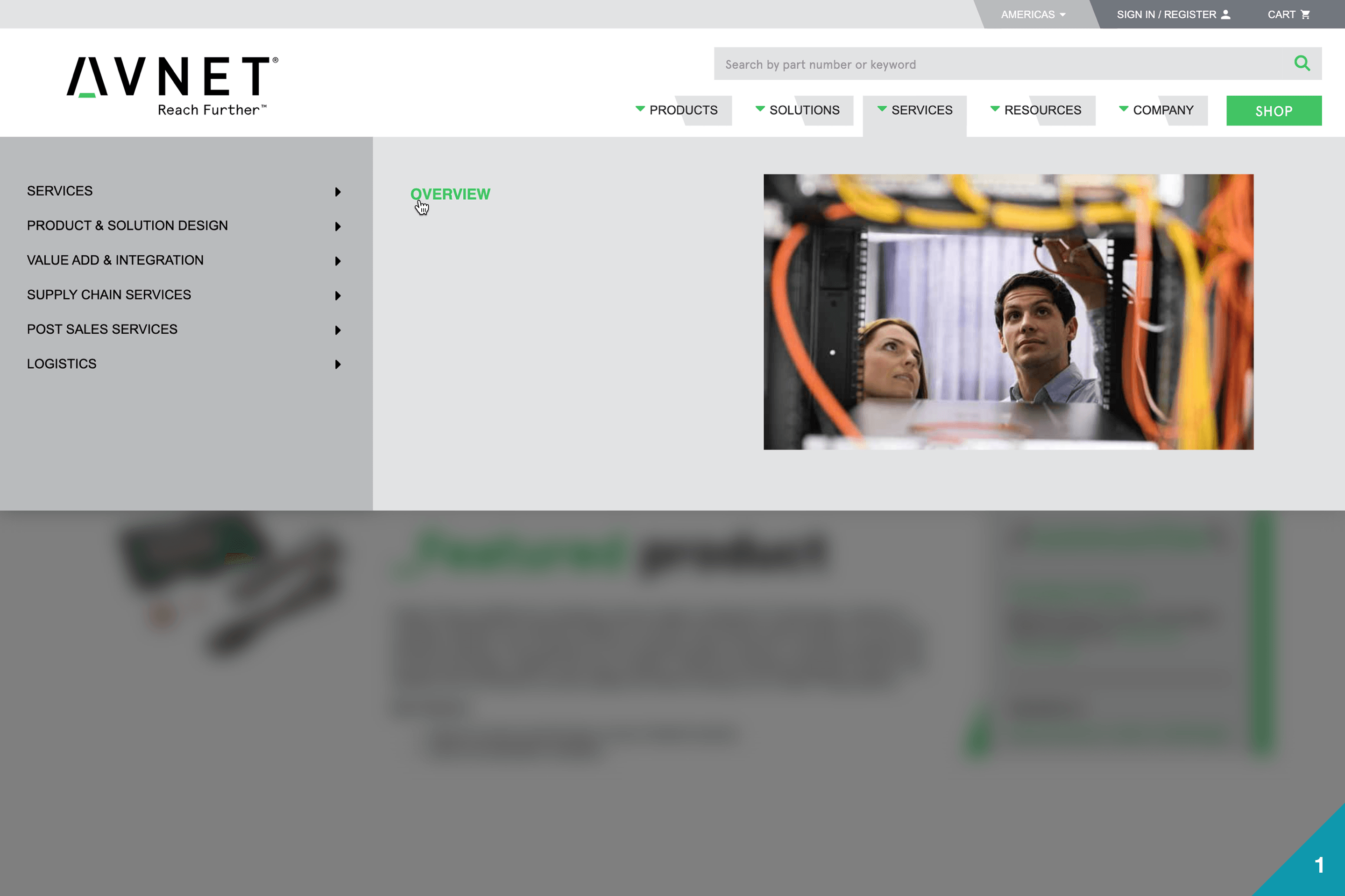
1. Layout
The primary solution was to create a layout that enhances visual hierarchy as well as improve the architecture of the menus.
2. Accessibility
Ensure that the header met accessibility guidelines provided by W3 Consortium. With a minimum score of AA success criterion.
3. Responsive
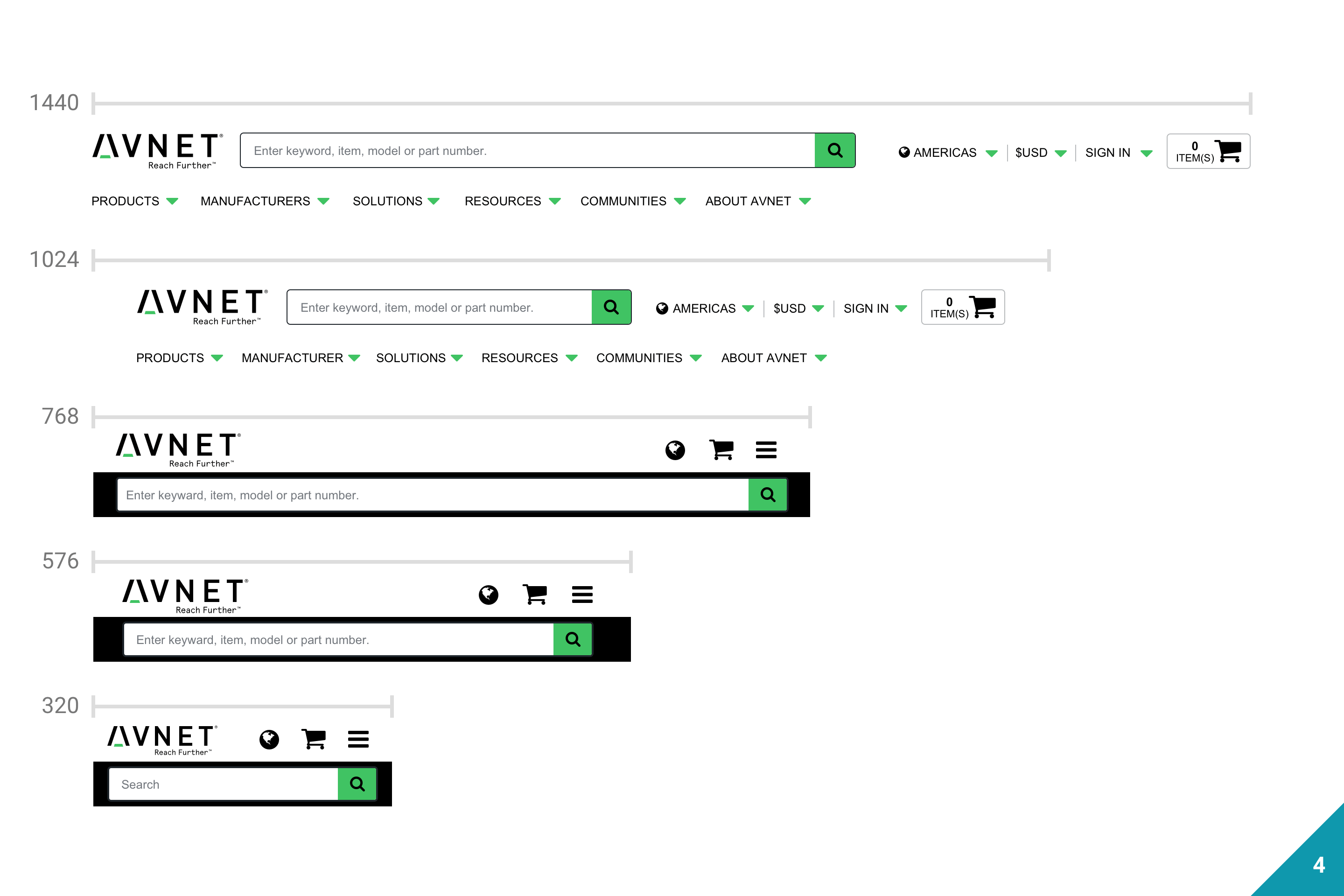
Implement a responsive navigation, so that the menu would be visible across all devices.
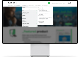
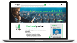
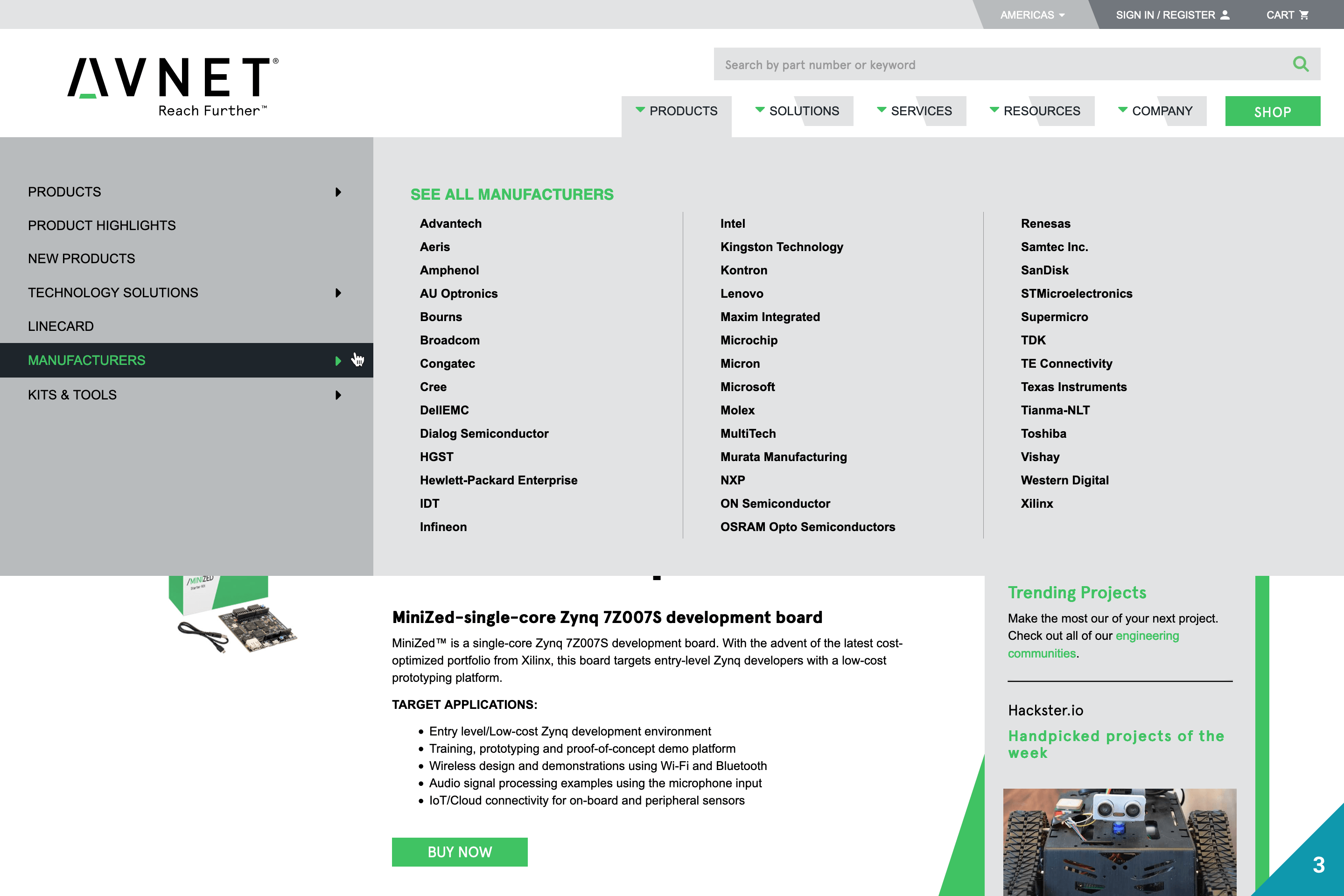
Fig: New header design with applied solutions
Problems Solved
Out of all the problems solved, here is a showcase of the main problems before and after the redesign.
Before - Redesign
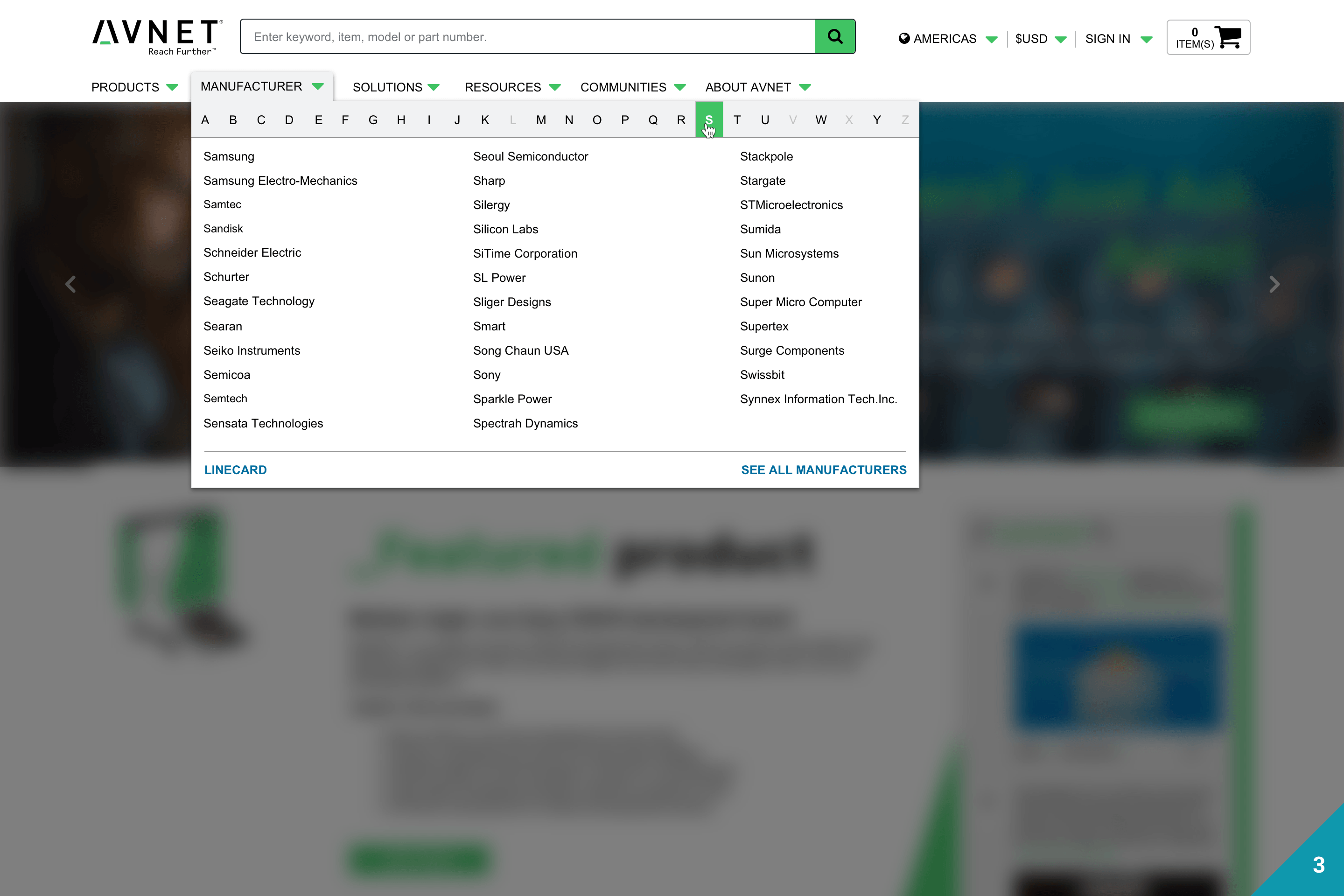
- The mega menu had a Z-Pattern layout, using a lot of space and enabling distant mouse movement. Ignoring implications of Fitts’ Law.
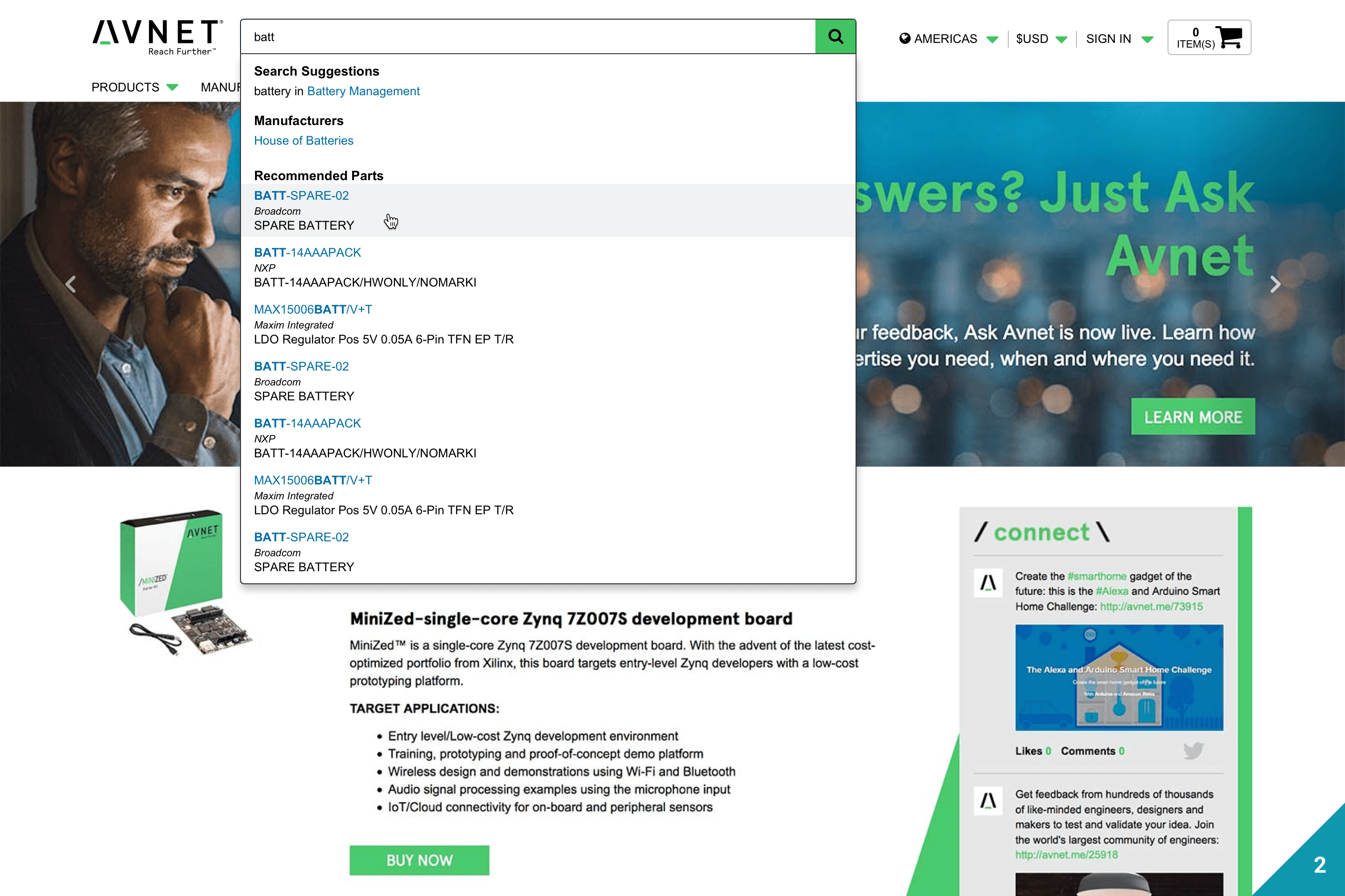
- The search bar was unrecognized as an input text field. Distorting the visibility of controls.
- A limited number of manufacturers were listed in the menu. To view all manufacturers, you would be directed to a page. Creating a high performance load.
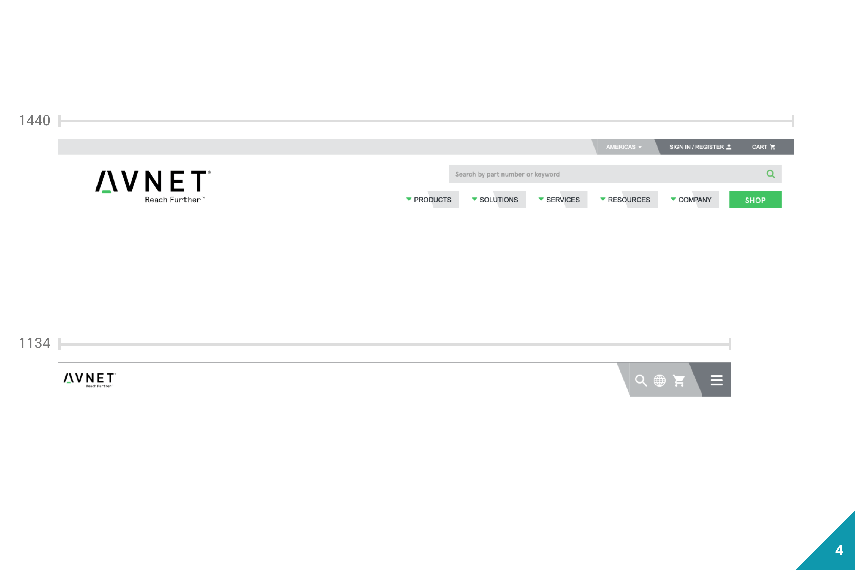
- The mobile menu would display in desktop view when the window was less than 1134px. Demoting main content categories on your desktop to another dropdown menu.
After - Redesign
- Going with a drop-down menu enabled rapid movement and conserved screen space.
- The search bar was converted to a traditional input text field, giving it a higher affordance.
- All manufactures needed to be listed in our navigation. Therefore, we created an alphabet letter selection filter.
- We implemented the best practices for a responsive navigation, allowing a better menu system across various screen sizes.

Process
This is a highlight of some of the steps in the process I did for this project.
Secondary Research
Competitive Analysis
Learned the ins and outs of how our competition works.
Baymard Research
Took into account insights from this research institute.
Persona/Scenario
Persona
Created the best representation of our user base.
Scenario
Created stories of how users will accomplish their goals.
Wireframes
Sketches
Used pen and paper to quickly get ideas across.
Wireframes
Created wireframes to get basic layout and flow concepts.
High-Fidelity Mockups
For high fidelity mockups I used Sketch to create the composition, and then pushed them to InVision for a click through prototype.
Testing/Feedback
Testing
Conducted at every step of the design process.
Feedback
Revised and improved each idea from the users and stakeholders.
Challenges
1. Collaboration Oversees
Avnet bought a company called Premier Farnell for $1 billion, and we needed to make sure our architecture and layout was parallel. So we had some limitations to make them compatible with each other.
2. Architecture
The architecture of the website was a little challenging in that different departments had certain preferences they wanted in the hierarchy. So taking into account I was tasked with working with a SEO manager to improve our optimization, there was many meetings of negotiating what link goes where.
Takeaways
1. Collaboration is best
Collaboration oversees might of been a challenge. But it was also one of the best ways to stay accountable to each other and unify the websites.
2. Test quickly and often
Testing at every step of the process helped create what is live today. Having input early influences the direction of the project heavily.