My Avnet Redesign
Expanding Self-Service Capabilities

The Details
Company
Avnet is an Amazon for tech companies. It’s a platform to buy electronic components to build the latest hardware. With a revenue at $20 billion a year, it’s a leading global technology solutions provider.
Team
As part of the Digital Transformation Team, I helped bring home the bacon for Avnet. I designed experiences and interfaces that high-profile tech companies use to purchase and engineer on shop.avnet.com.
Role
I was the lead UX designer on a team comprised of three designers, a business system analyst, a web analytics manager, an eCommerce merchandising manager, and three developers. I was responsible for determining the overall design direction of the project, while collaborating with the rest of the team on ideation.
Tools
My go to tools for this project was Sketch, InVision, Photoshop, OmniGraffle, PowerPoint, iPhone X, MacBook Pro
The Purpose
Problem
Customers had a difficult time navigating their account and finding the information they needed. It wasn’t responsive and wouldn’t allow customers basic administration controls. Like allowing them to change a password on their own.
Goal
Redesign and enhance the self-service platform (My Avnet) that allows our customers access to information and perform routine tasks, without requiring any interaction with a representative.
Once fully implemented our consumers will be able to handle simple administrative functions such as resetting passwords, creating reports, and track orders, to more complex actions, such as viewing and managing their forecast projections.
Benefits: 24-hour support | Immediate access to information | Lower company representative costs | Increase quality of customer service by eliminating monotonous requests | Gather more data and analytics from our customers
The Process
Method
Agile Methodology was used to accomplish this project. Each stage of the process was divided into 2-4 week sprints. Which was reiterated with each section of the Self-Service modules.
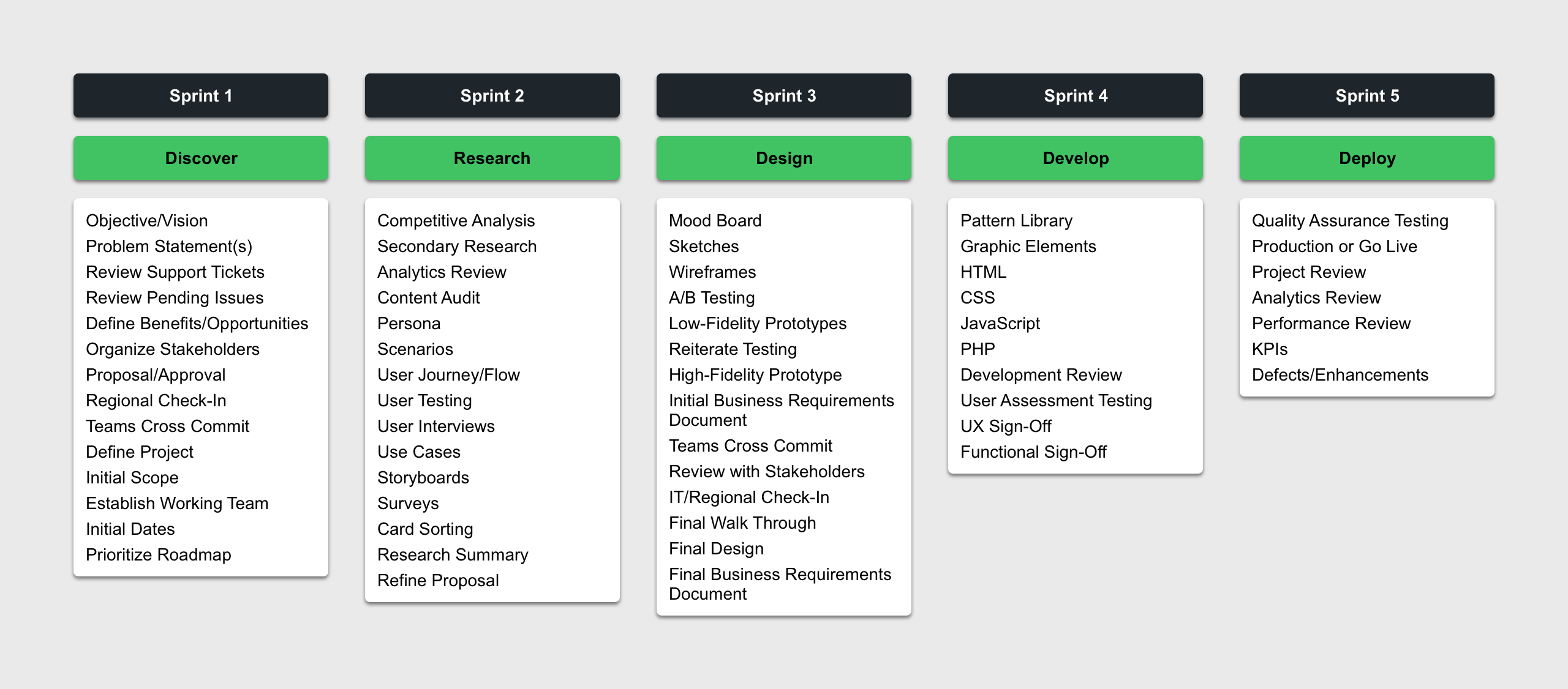
Sprint 1 Discover
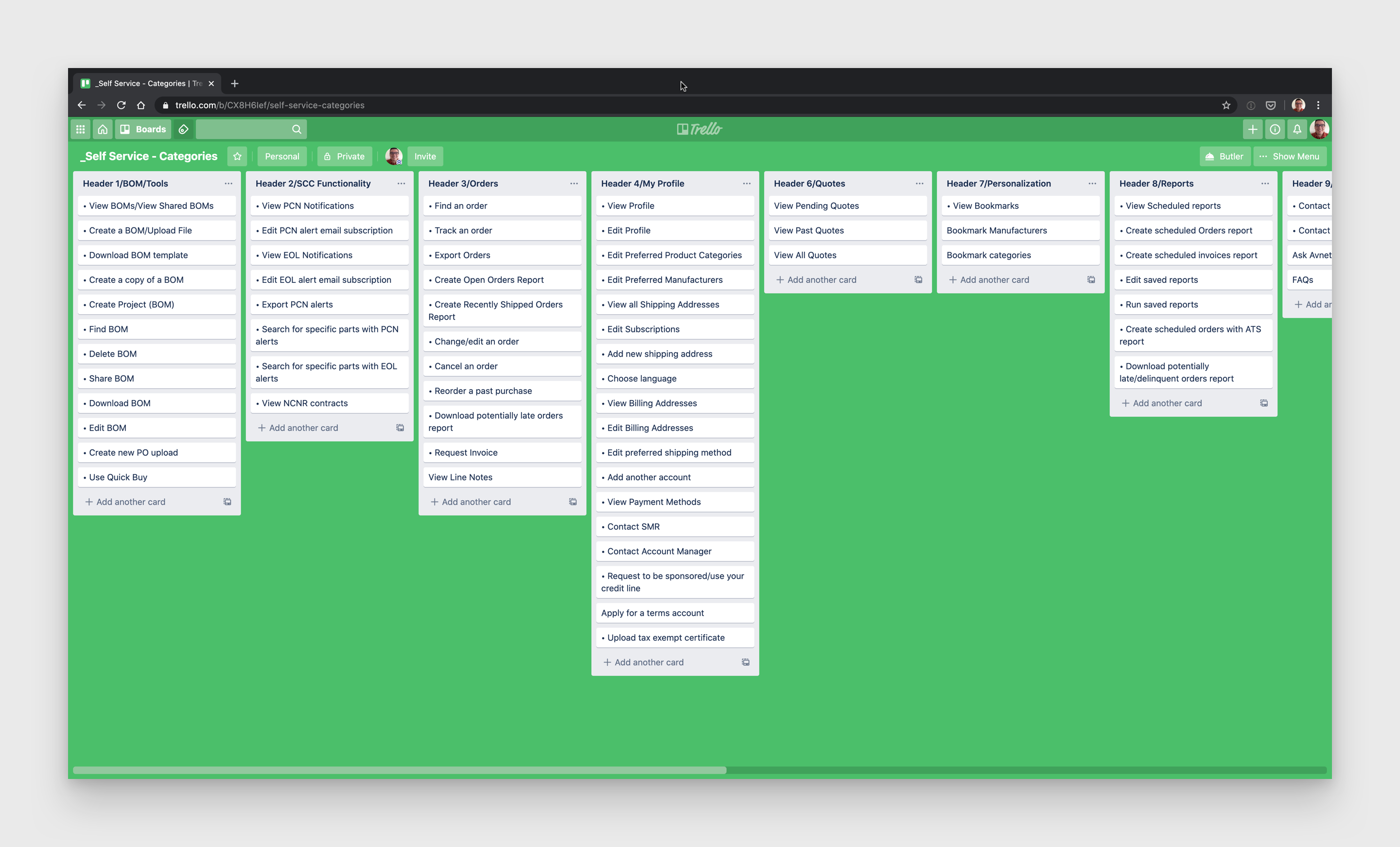
Breadth - Organizing Categories
After doing a quick content audit of the main elements on the dashboard, we translated them to Trello cards. This enabled us to implemented a method of card sorting so we could group the items and create appropriate categories.
Depth - Defining Listed Items
Additionally, we listed all the support tickets, pending issues, and opportunities under the appropriate category aforementioned. Each item also contained more details: Paint points, enhancements, nice to haves | Context, stakeholders, success criteria, risks, and assumptions/dependencies | Features impact/effort (low, medium, high)


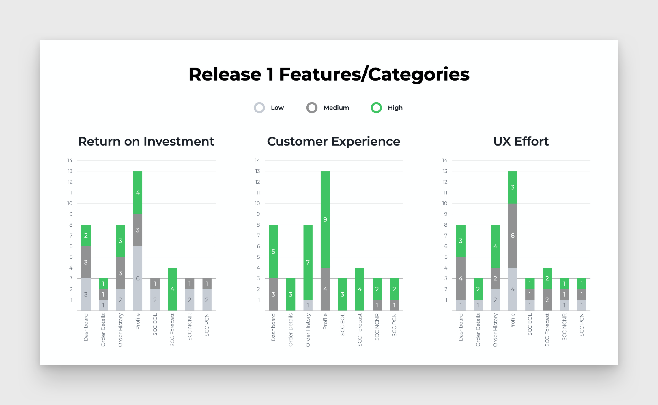
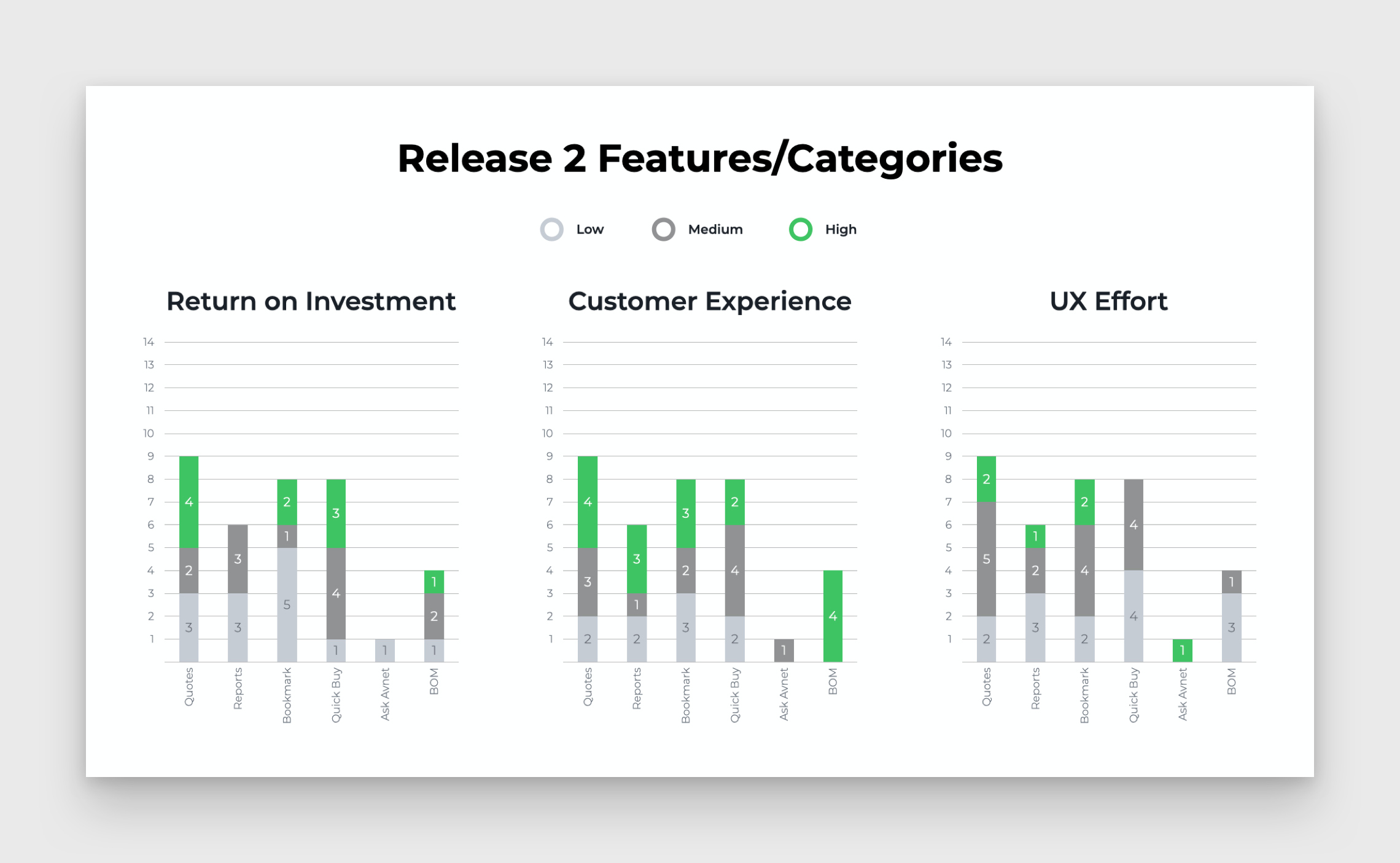
Preparing Data
We exported all this information into an excel format. This was used so that we could have a table version of our data, as well as the ability to produce various graphical representations of each category/feature.
Data Visualization
The most important metrics we pursed were Return on Investment, Customer Experience, and UX Effort. Each of those particulates were given a value of low, medium, or high. This gave us the information we needed to figure out how to prioritize this project.
“We applied the 80/20 rule to find the most valuable return on the project. By measuring the design enhancements, features, and effort, we were able to break it down into 2 releases.“
As you can see from the results, we concluded the best option was to complete this project in 2 major releases.
Release 1 would encompass Dashboard | Order Details | Order History | Profile | SCC
Release 2 would encompass Quotes | Reports | Bookmark | Quick Buy | Ask Avnet | BOM
Sprint 2 Research
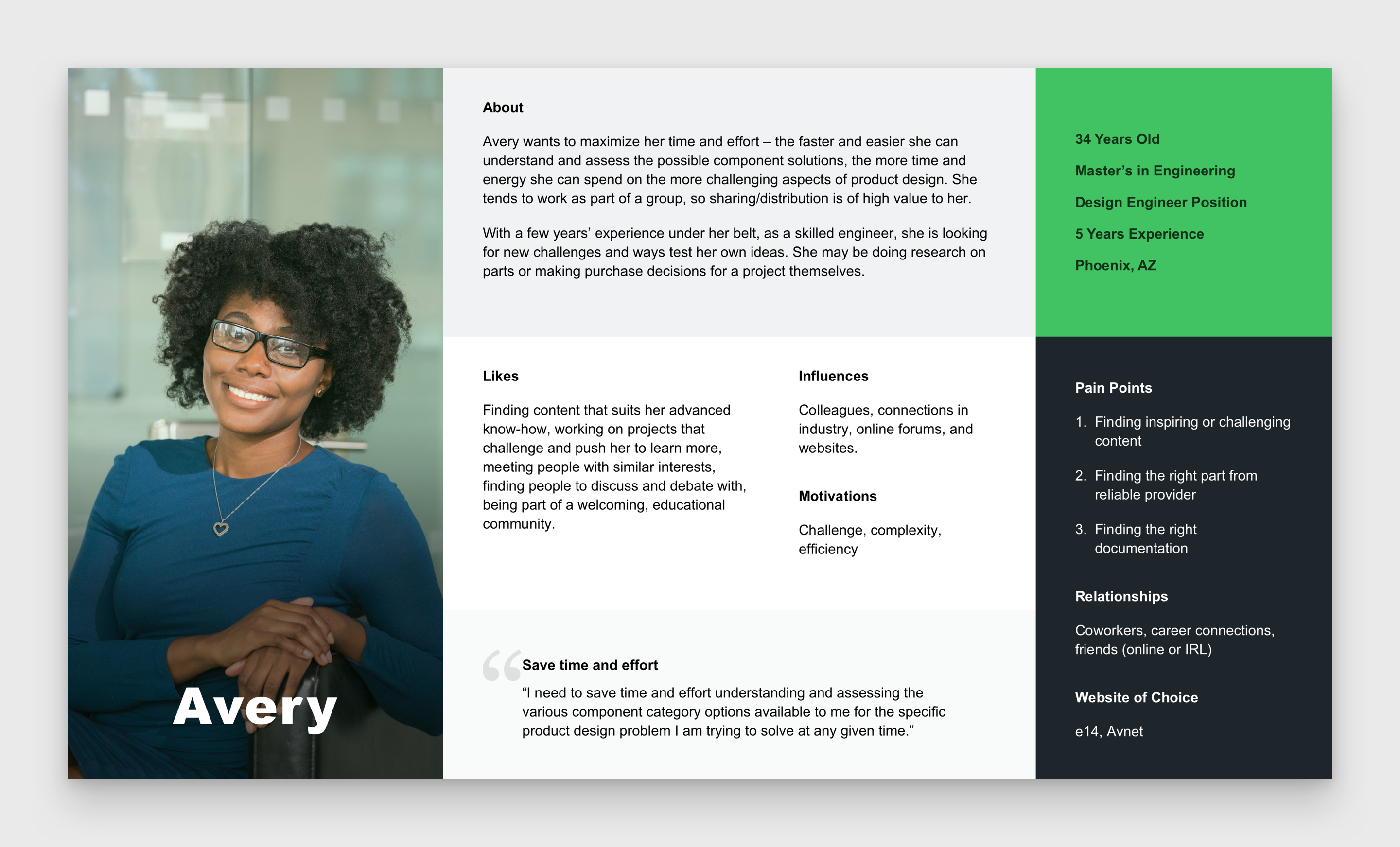
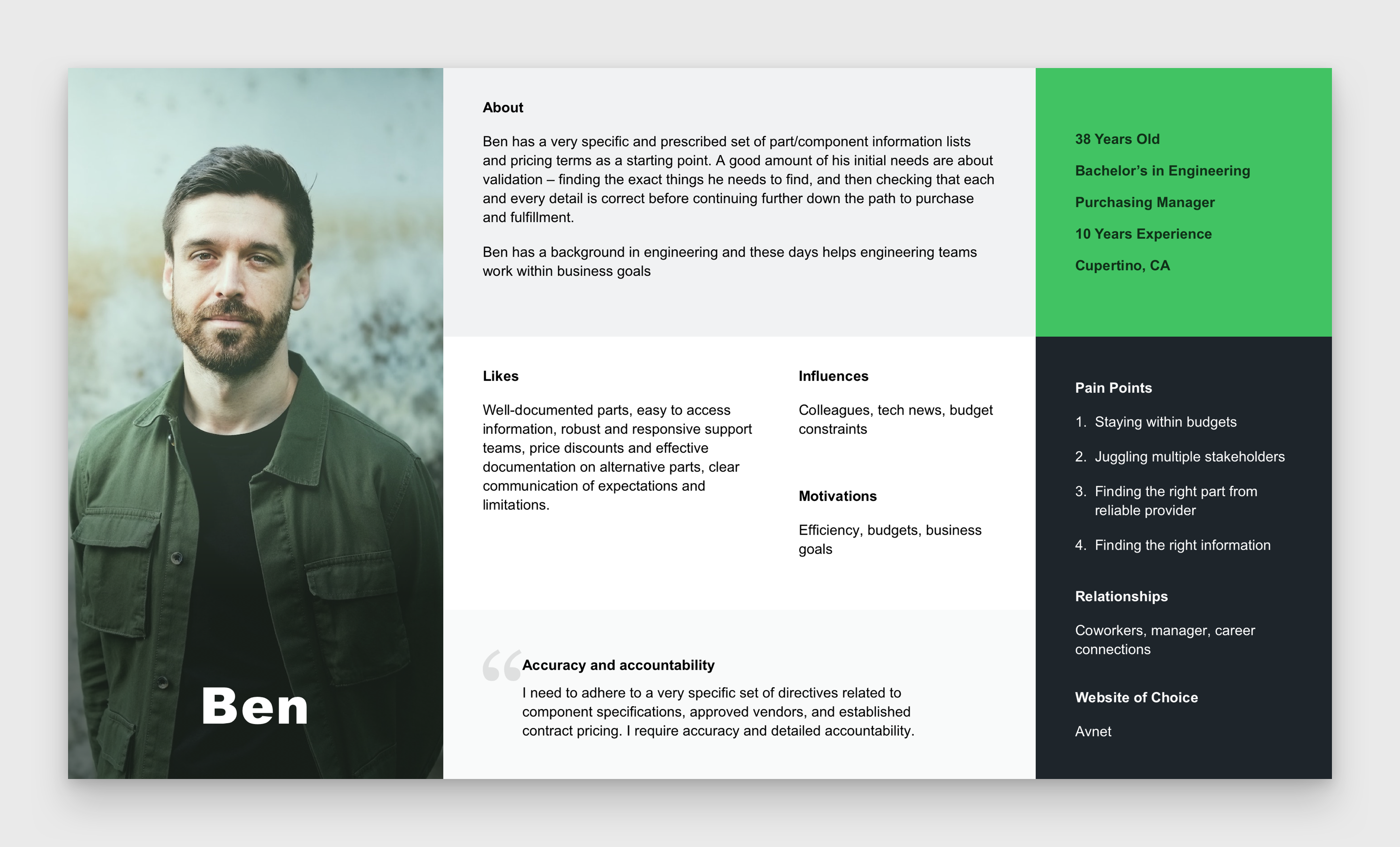
Personas
These are the two main personas we wanted to design for. One is an engineer, who comes to our website to do research on components. While the other is a buyer, or rather a purchase manager, which procures the all the proper amount of parts.
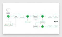
User Flow
I mapped out various flows that we wanted a typical user to take. We wanted to keep it as simple as possible for the user, so we emphasized progressive disclosure, separating information into multiple layers. I collaborated with various stakeholders, including directors and senior vice presidents, to confirm the best solution for this project.
Sprint 3 Design
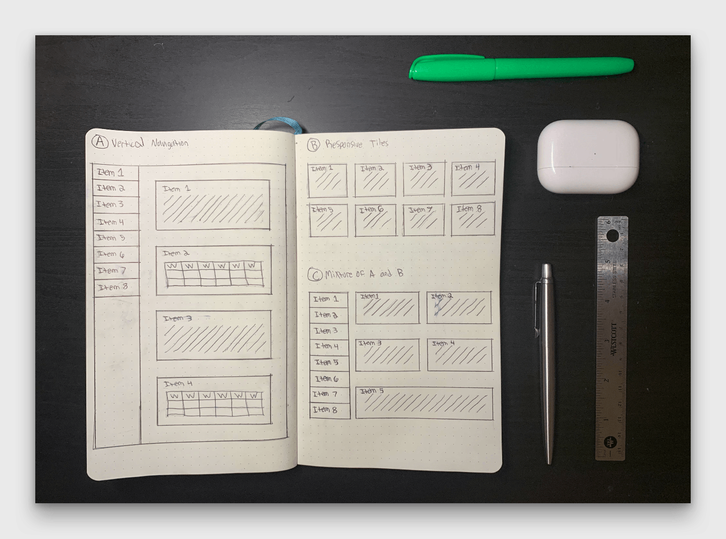
Sketches
I used my Moleskine notebook to create quick sketches of the several layouts. The idea was to make something that would easily incorporate the bootstrap framework, but also give each feature/item a preview of information. The layouts included, but not limited to:
- Vertical navigation with large snippets of information
- Responsive tiles that have very limited amount of information
- Mixing A and B with medium to large snippets.
Wireframes
In order to have accuracy to the concepts, I created small, and large, versions. The small was just to show the gist of the layout. While the large ones would have a little more operational detail.

Low-Fidelity Mockups
The bootstrap framework was essential. So, I used a bootstrap sketch template to demonstrate high-level data. This is where I confirmed which design direction we would head. After that I would add even more components and data to iron out all the kinks.
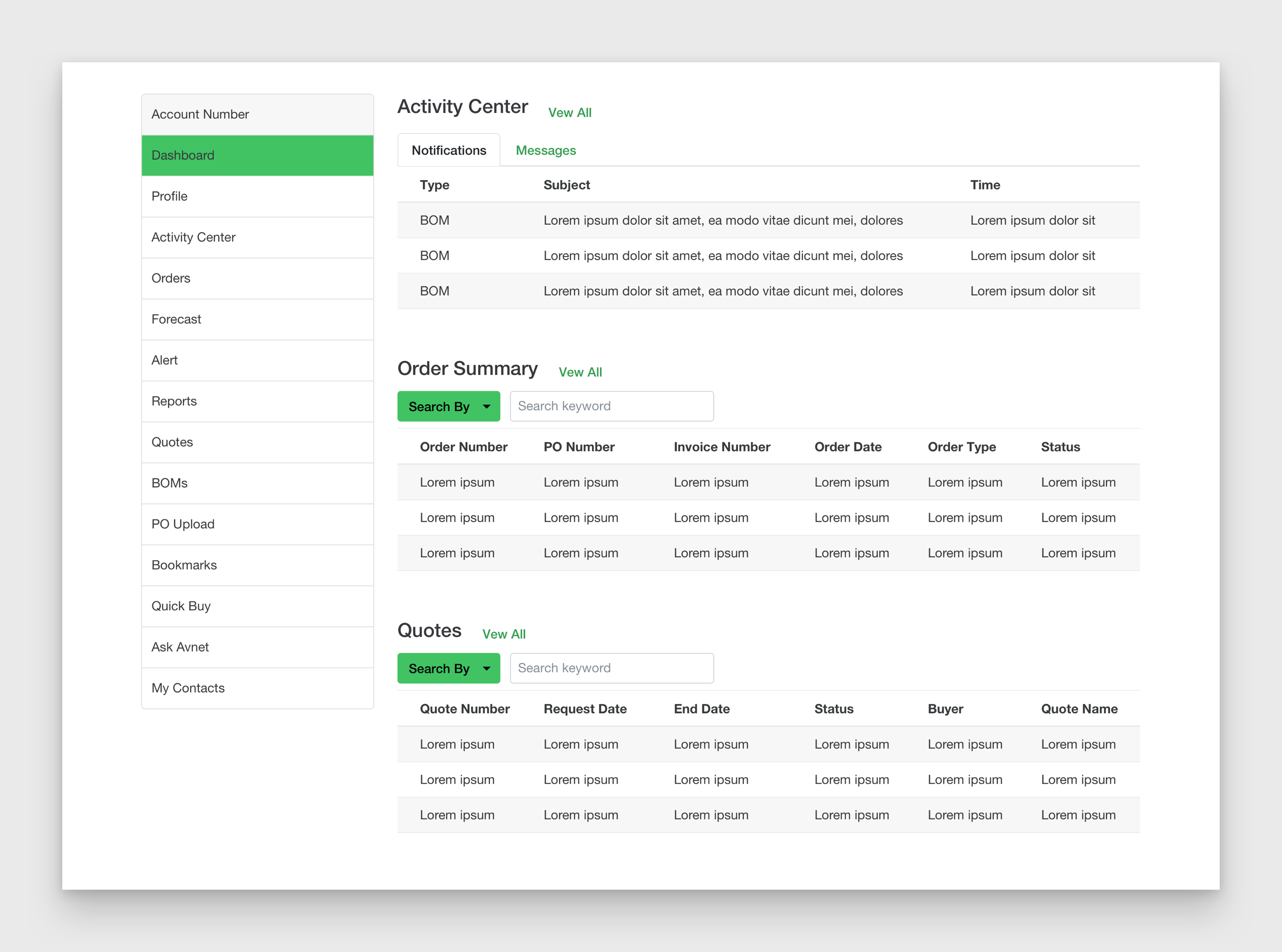
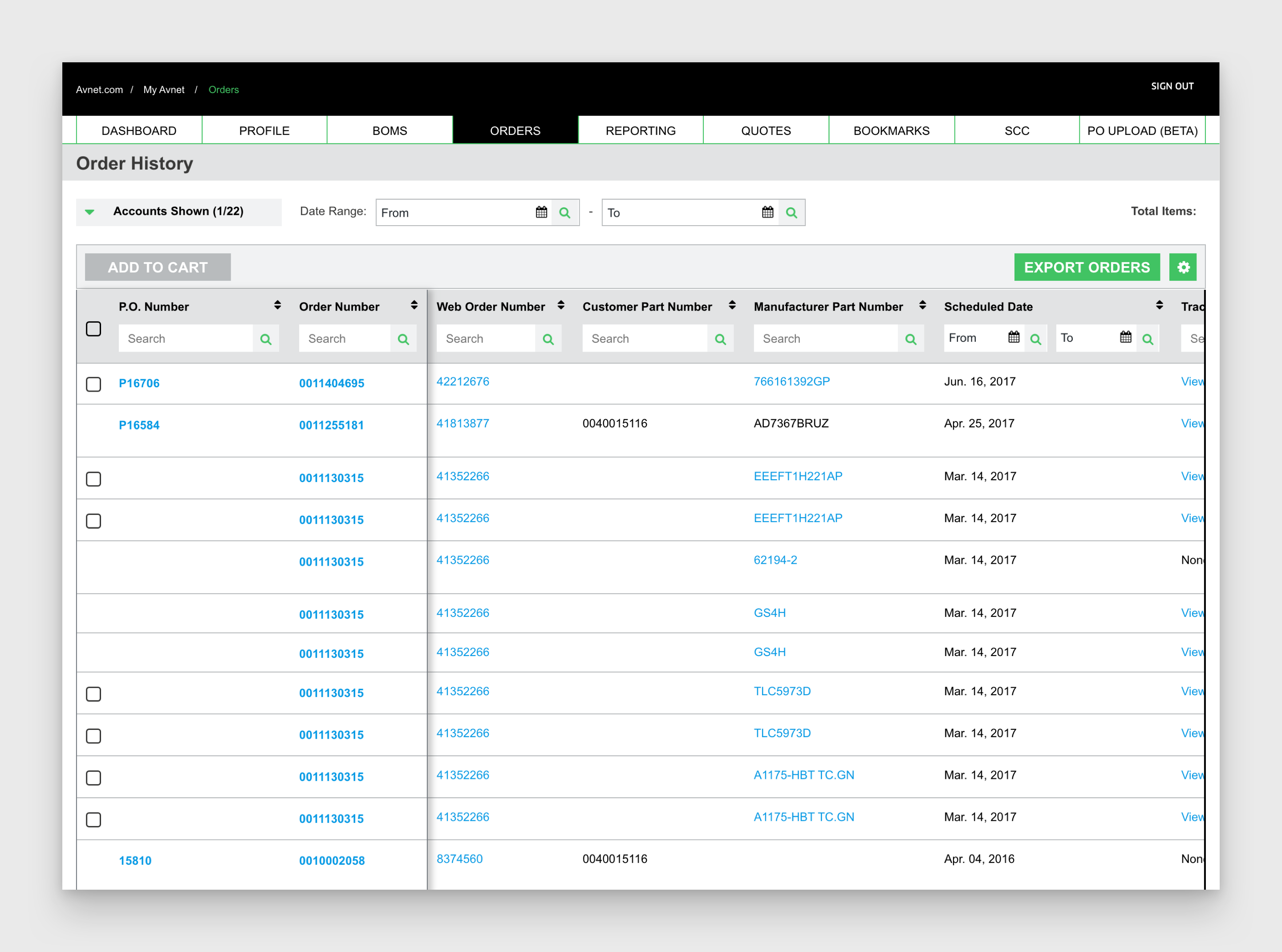
High-Fidelity Mockups
This is where it gets really juicy. It’s a peak into some of the designs I did for this massive project. Look at this as a before/after photoshoot. Also note that this entire sprint incorporated multiple iterations to make sure all components, flows, and operations were accounted for.
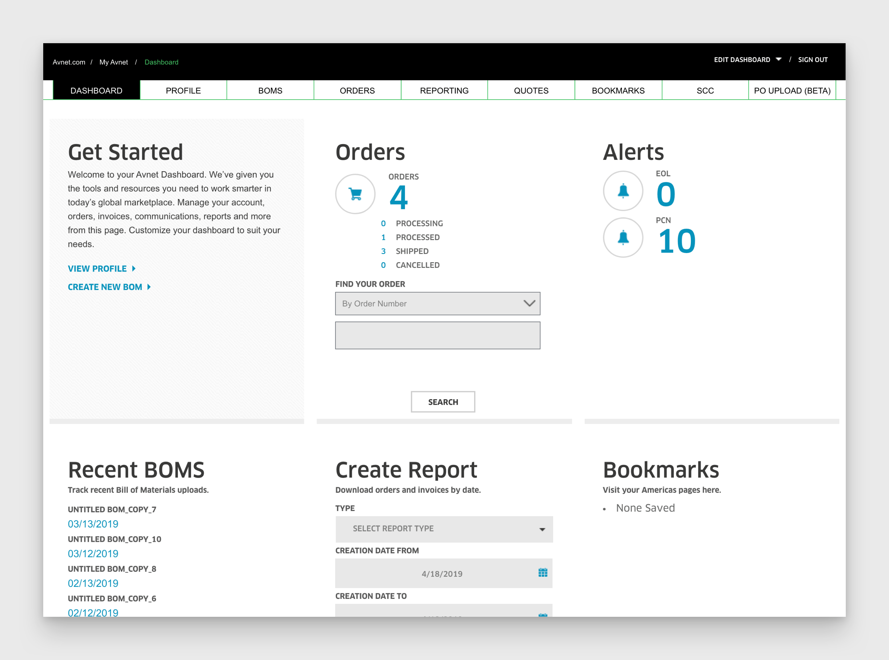
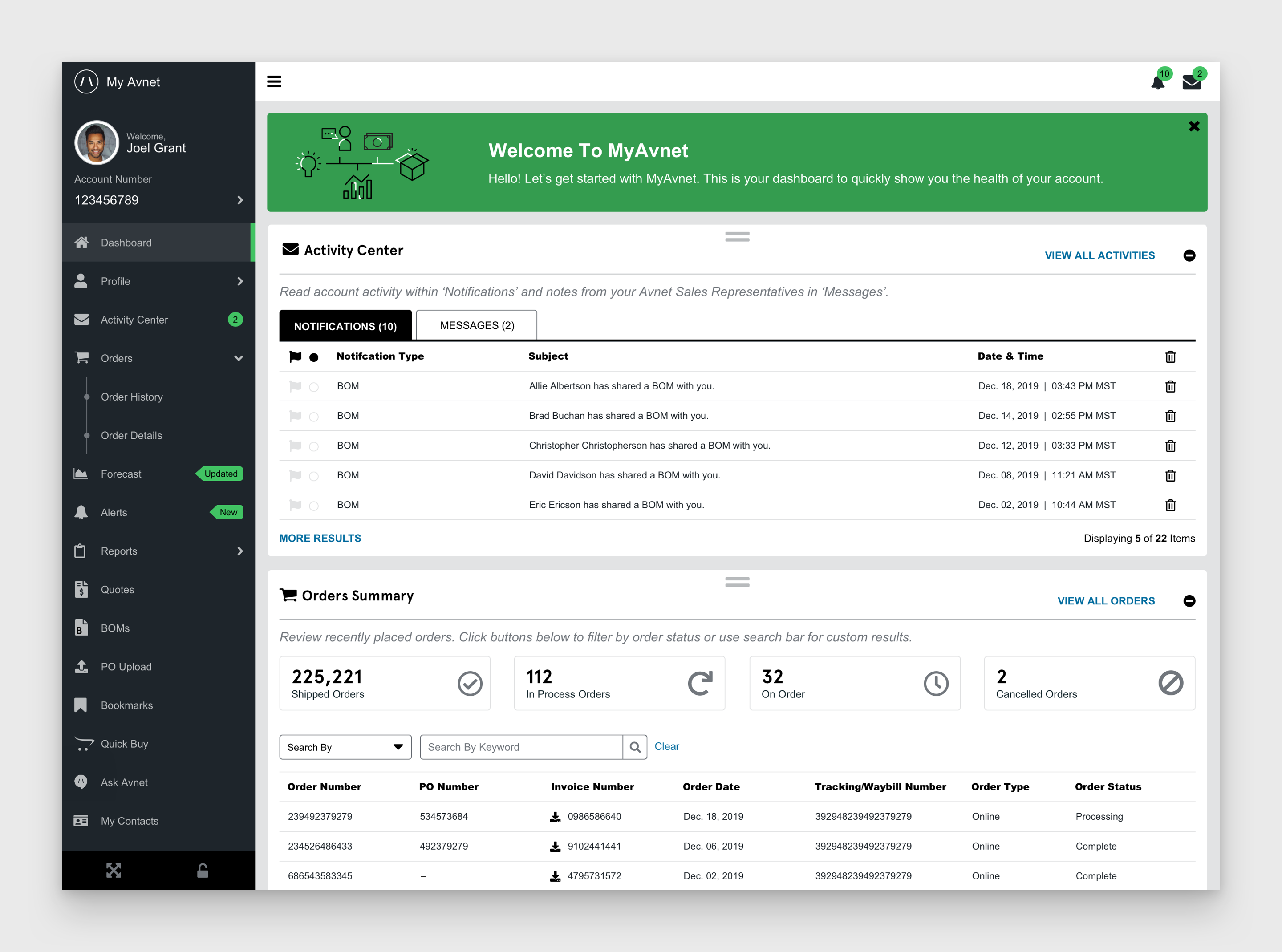
Dashboard
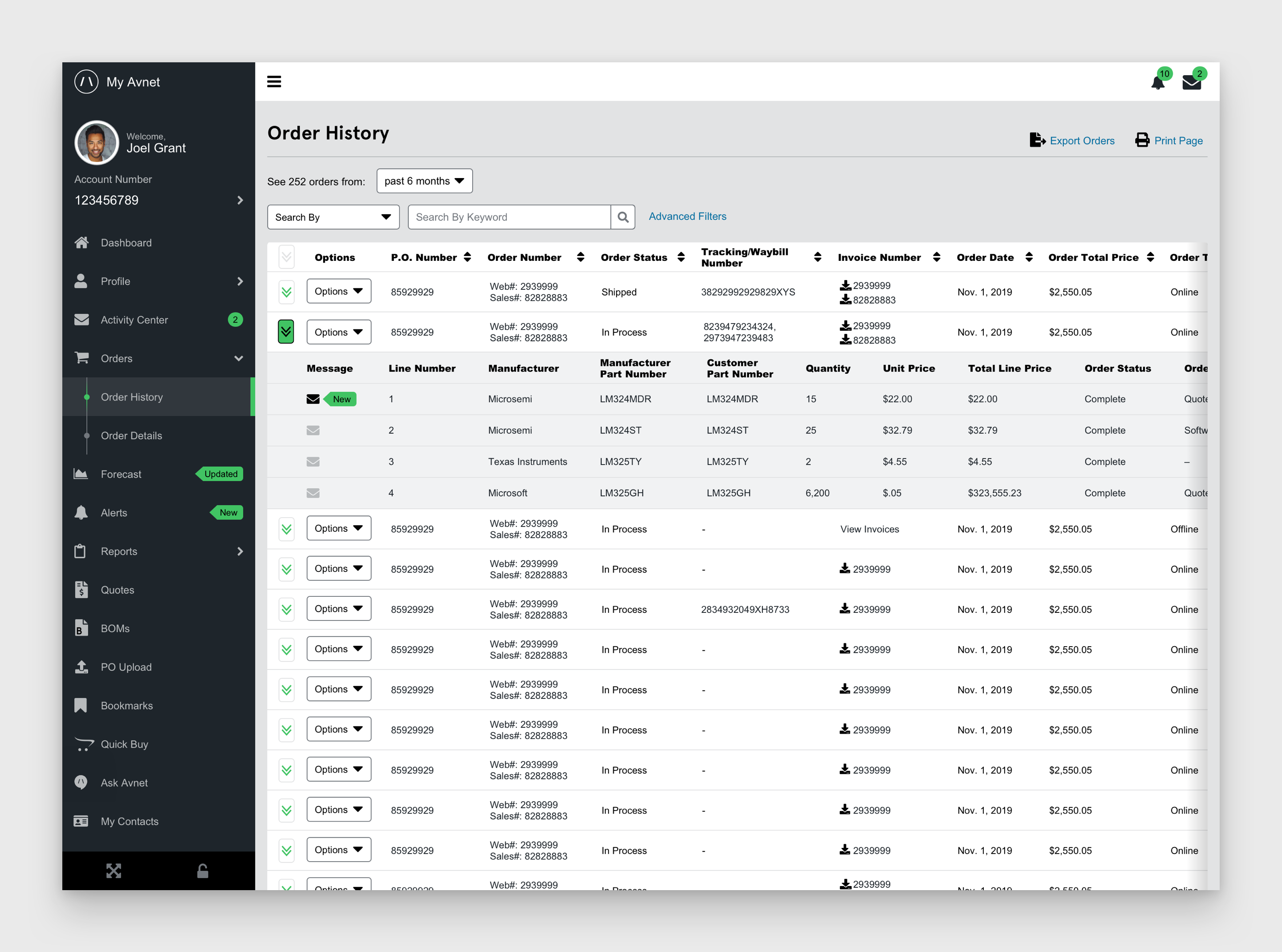
Order History
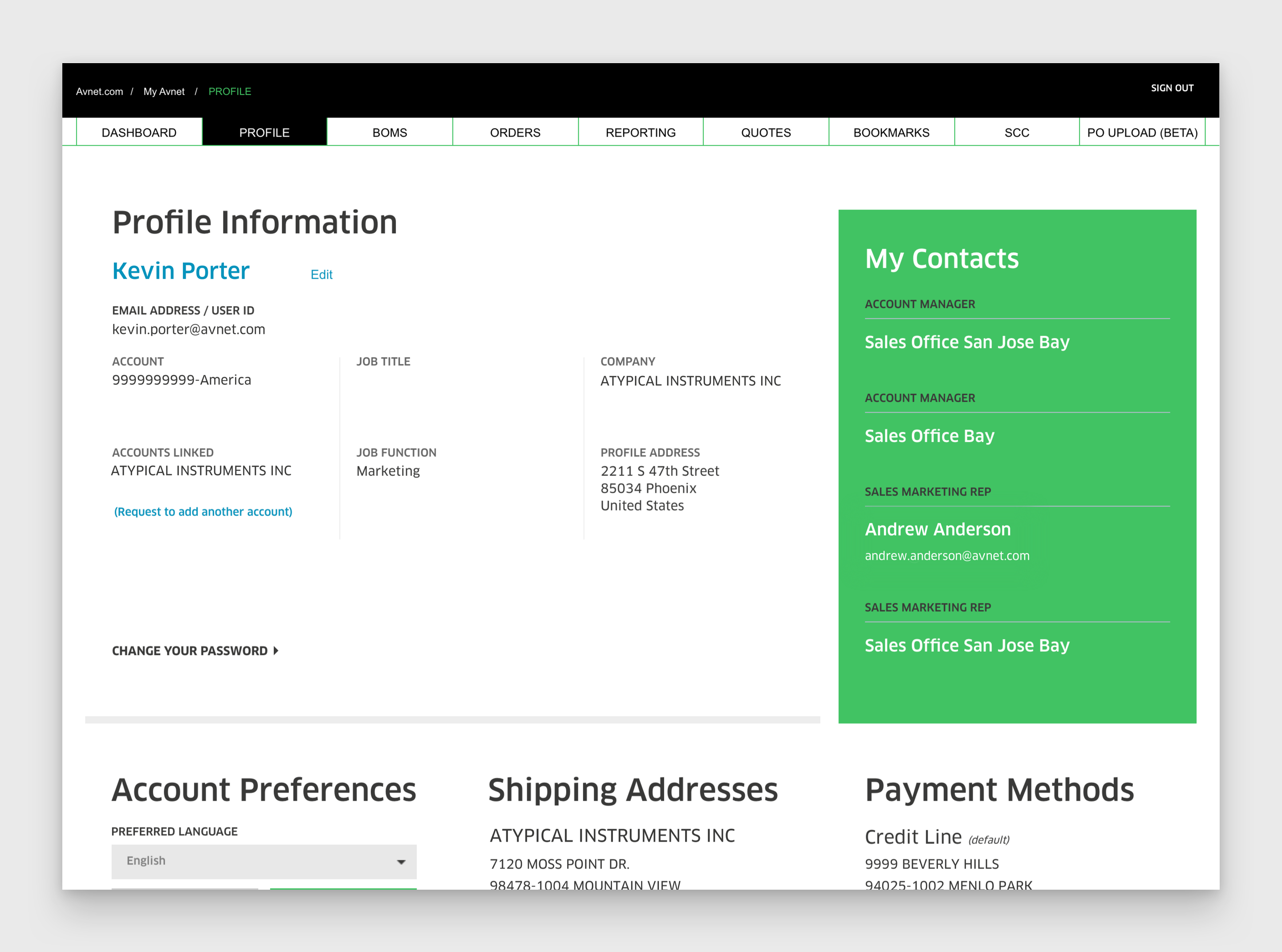
Profile

Sprint 4 Develop
Asset Delivery
Turned over all our assets to the development team. This included the pattern library, graphical elements, and sometime HTML/CSS and JavaScript. Our final design was done in sketch then pushed to InVision. Which allowed the developers to see all the specs they needed to develop the product.
Sprint 5 Deploy
Production
Once all the flaws were perfected, and bugs squished, it was published for all the see. Afterwards we reviewed the overall project, analytics, and performance. Then we swept over the live version again to check if there are other defects, and ticket those for further enhancements.