Header Redesign
Enhanced Browsing Experience

The Purpose
Problem
After scanning through support tickets and talking with various stakeholders, it was apparent that the design of the header had many usability, accessibility, and organizational issues. In fact, 37% of the support tickets were header related.
Goal
Reduce user support tickets by focusing on the following areas:
Layout
The primary solution was to create a layout that enhances visual hierarchy as well as improve the architecture of the menus.
Accessibility
Ensure that the header met accessibility guidelines provided by W3 Consortium. With a minimum score of AA success criterion.
Responsiveness
Implement a responsive navigation, so that the menu would be visible across all devices.
The Result
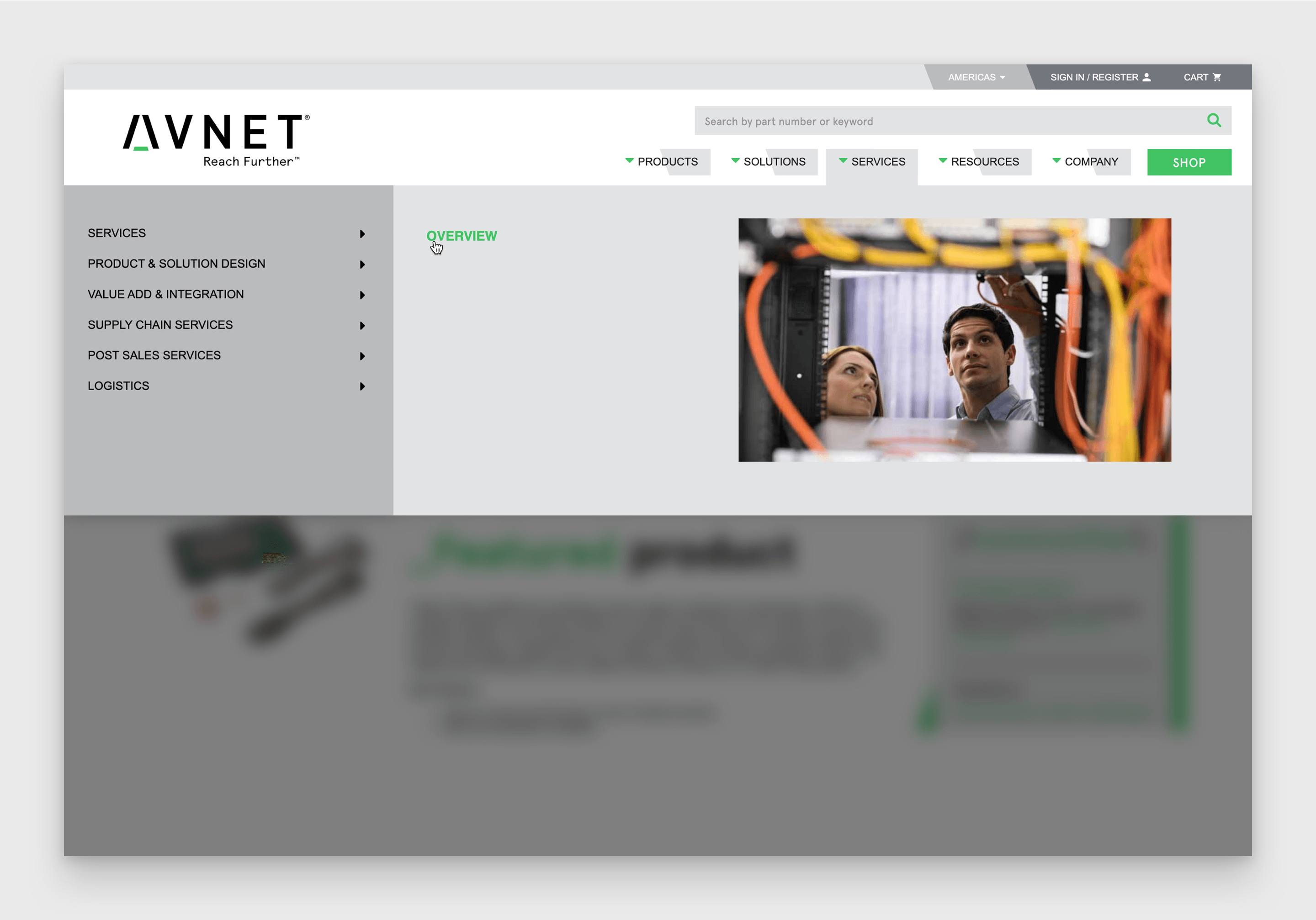
Before
The mega menu had a Z-Pattern layout, using a lot of space and enabling distant mouse movement. Ignoring implications of Fitts’ Law.
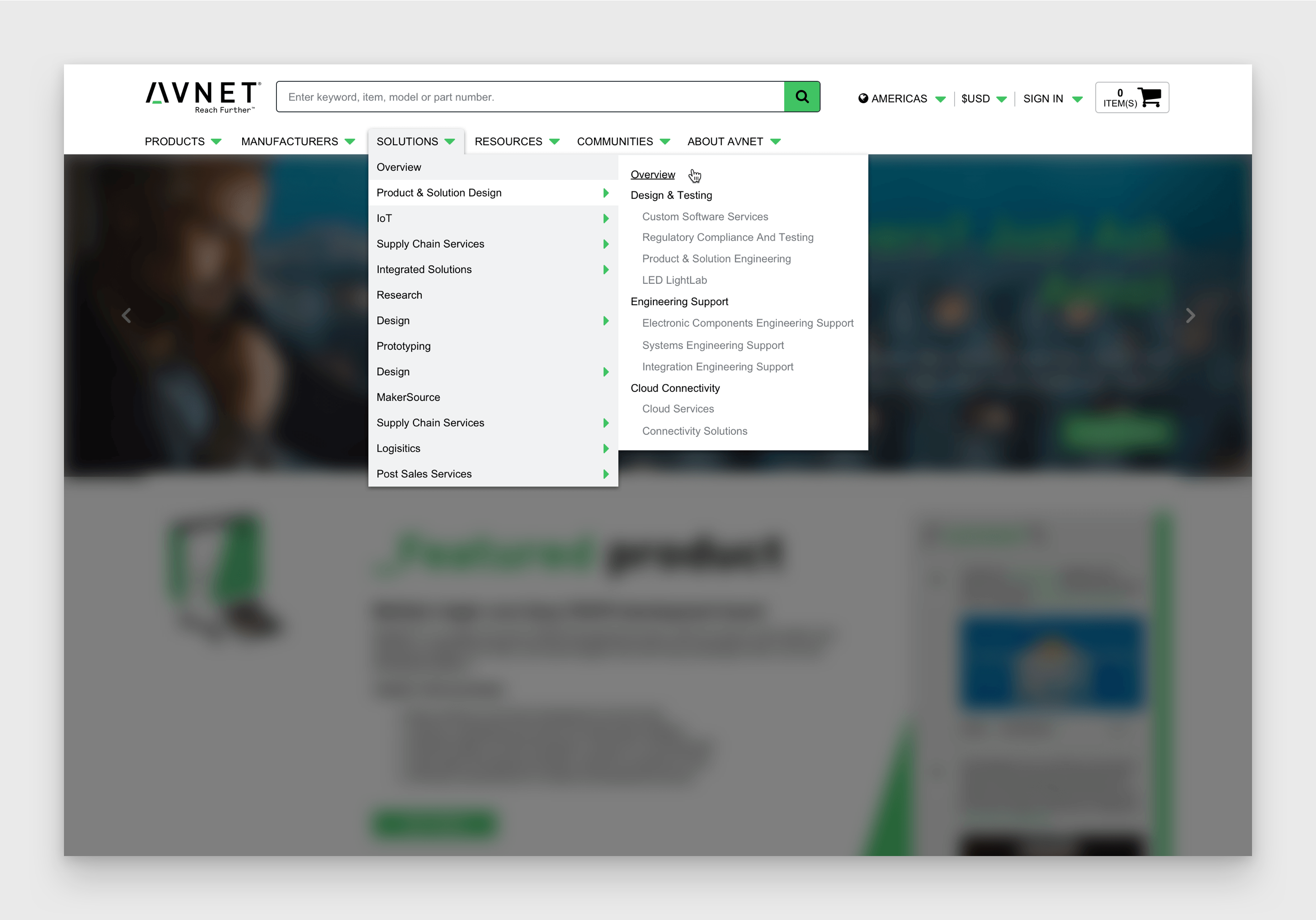
After
Going with a drop-down menu enabled rapid movement and conserved screen space.
Before
The search bar was unrecognized as an input text field. Distorting the visibility of controls.
After
The search bar was converted to a traditional input text field, giving it a higher affordance.

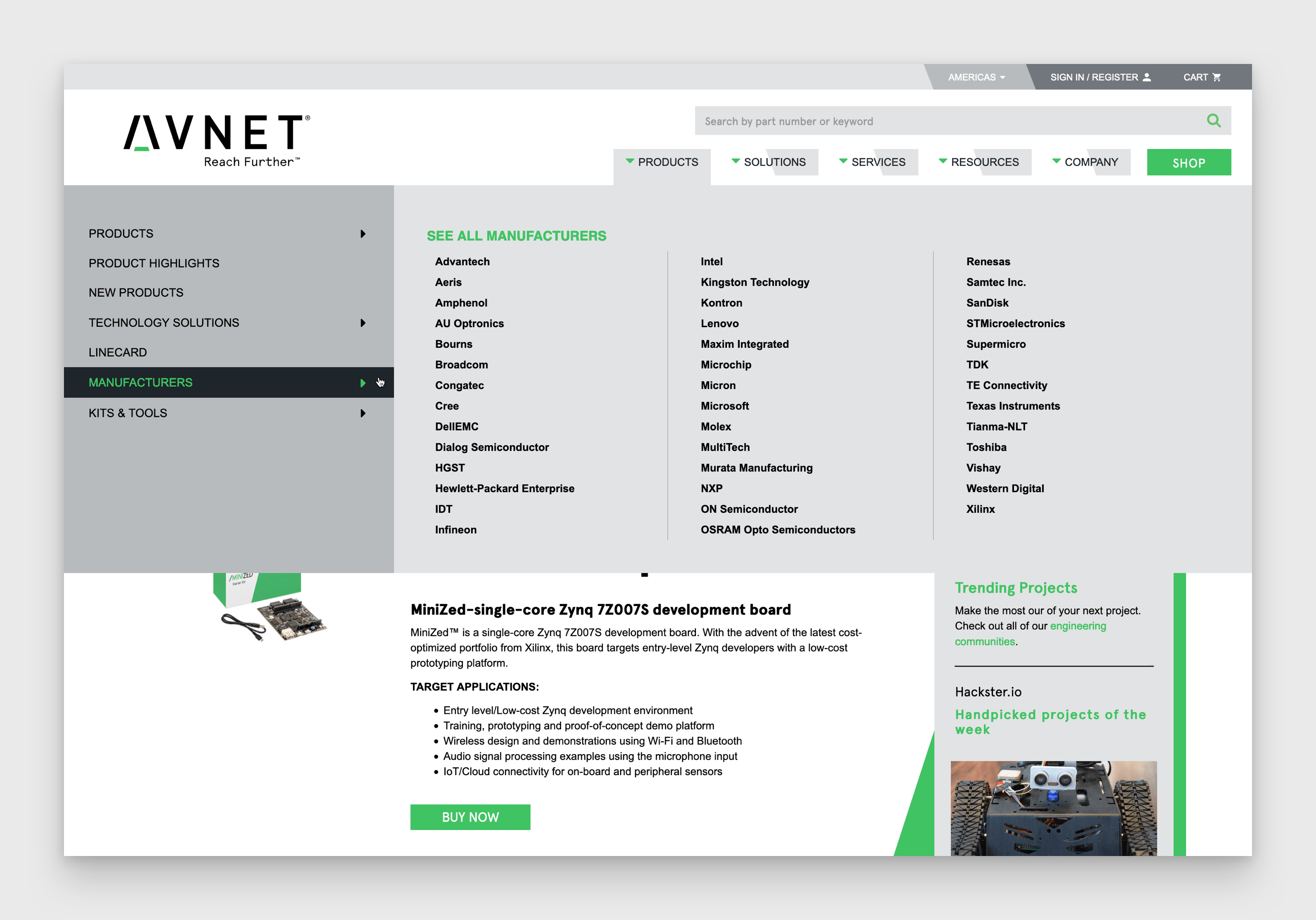
Before
A limited number of manufacturers were listed in the menu. To view all manufacturers, you would be directed to a page. Creating a high-performance load.
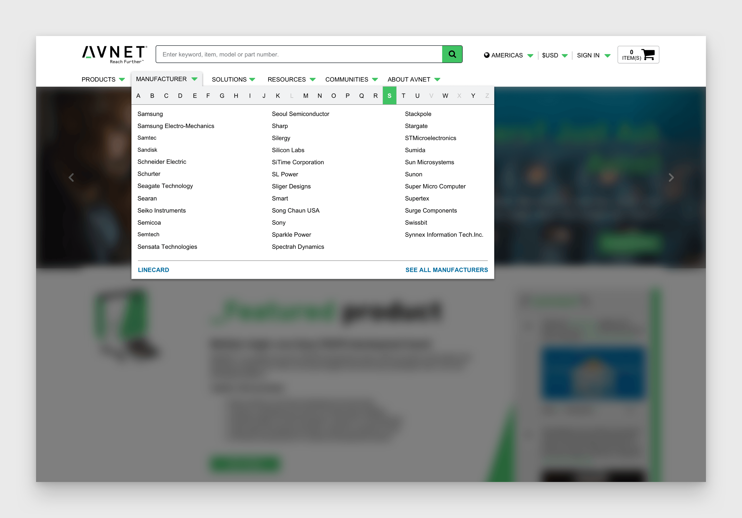
After
All manufactures needed to be listed in our navigation. Therefore, we created an alphabet letter selection filter.
Before
The mobile menu would display in desktop view when the window was less than 1134px. Demoting main content categories on your desktop to another dropdown menu.
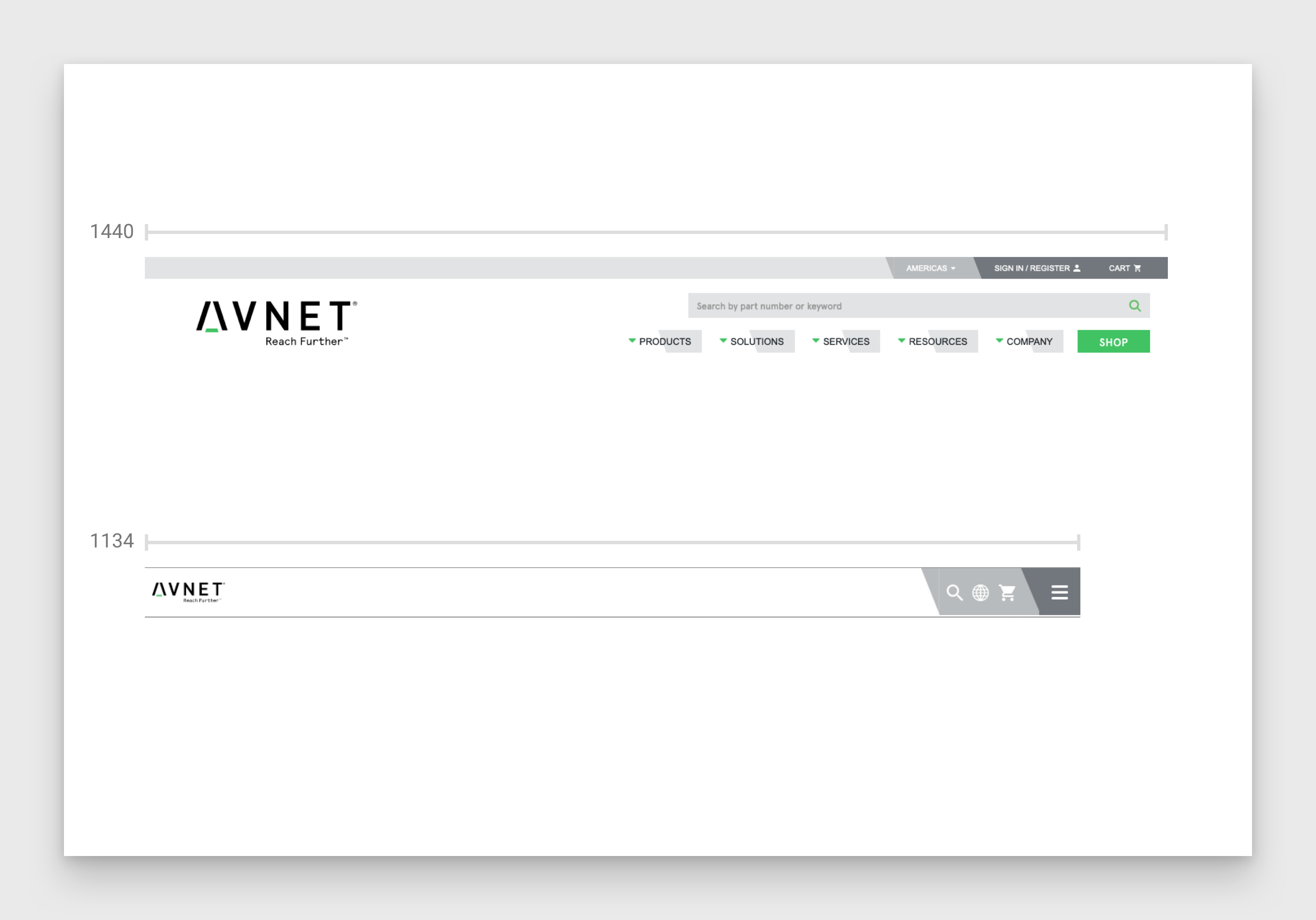
After
We implemented the best practices for a responsive navigation, allowing a better menu system across various screen sizes.
